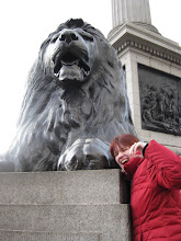
When I started this project, I knew I had to make my final product in color. I have a great fondness for pen and ink, and I think black and white work can be really beautiful if done well (take, for example, Maus by Art Spiegelman and Blankets by Craig Thompson), but I knew that I wouldn't be happy with pure black and white for my final product. There is so much beautiful color in places like London and Istanbul-- I thought I'd be cheating these places of some of their life if I only used black and white.
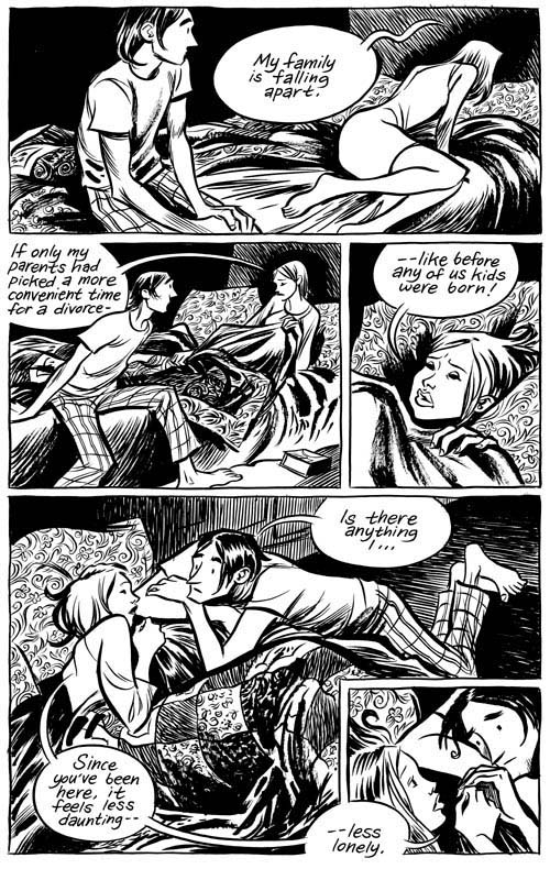
In this way, a lack of color can emphasize the feeling of missing such beauty. For one of my more recent spreads, I decided to experiment with color vs. black and white to get my point across. In this spread, my boyfriend comes to visit me in London, and I am eager to show him everything I have come to love. Throughout my time abroad, I was always so excited about everything I was experiencing, but there was always this pang of homesickness for the people I left in the U.S.-- a lot of times, that was my boyfriend. I wanted him to be a part of everything I was seeing and doing. And, for four days in March, he actually got to be. So I did have this feeling of the landscape of London getting extra meaning, or extra "life," from the two of us being there together. (Corny, I know-- what can I say, I'm a lovesick puppy sometimes.) So for this spread, I demonstrated how him being in London made everything that much more alive and colorful to me.

I started with a light grey wash over what I wanted to be black and white.

This is a close-up of that first panel: me waiting for him outside his hotel, in black and white because he's not with me yet.

Close-up on the first of three middle panels that sweep across both pages. This is an exaggerated field of flowers in St. James Park near Buckingham Palace. I really loved the visual of having these dull grey flowers suddenly blooming bright yellow as we walked by.

The final product for the first half of the spread. Here, you can see the color appears when we hug, and the three locations (St. James Park, the Millennium Bridge, and the Royal Festival Hall) all fade from black and white to color depending on where he and I are walking.

The second page of the spread works much the same way as the first, with color signifying where we are together. When we are hugging goodbye, the color is still there, but after we say goodbye the color disappears. In the last panel (shown directly above) everything goes back to being black and white, but there is a little hint of my new perspective on things: a bright yellow flower popping up out of the crack in the sidewalk.
there was always this pang of homesickness for the people I left in the U.S.-- a lot of times, that was my boyfriend.
ReplyDeleteBUT MOSTLY IT WAS YOUR SISTER RRAAAWWWWRRRR
YOU GET A SPREAD TOO CALM DOOOOWWWNNN
ReplyDelete