Saturday, October 31, 2009

Wanderlust Revisited

A few posts back, I outlined the process of how I edited and arranged a particular spread entitled Wanderlust. Well, since that post, it has gone through even more edits, so I wanted to share those with you too.


This is what it looked like at the end of my last post. But I still felt like there was something missing. I hadn't yet added text, and the funky frames weren't conducive to normal ways of handling text, so I felt I had to get a little more creative.


So those two shots are of what I ended up doing. They're a tad blurry, but you get the idea: I made the frames themselves into letters that spell out the title of the spread, and let the rest of the text wander freely as the frames themselves do.

I got the idea to make the frames into text from a few different sources:

1) Bill gave me the name of Marian Bantjes, a Canadian designer who does a lot of really amazing things with typography. You cans see her work at: http://www.bantjes.com/

2) A phenomenal DC Comics illustrator named Alex Ross, whose anthology book includes this as an introduction to the work he did for the Justice League:


3) Funnily enough, I believe I was also a bit inspired by the type for the London 2012 Olympics logo, because despite the controversy surrounding it, the type is chunky enough to allow for other images to be placed inside it. Whether or not I think the logo is any good is a different story (I don't personally think it is), but it is from London, just like my stories, and I think I was channeling that kind of type when making this spread.


That's all for now. More spreads to come later in the week. Happy Halloween everybody!

Tuesday, October 27, 2009

Before and After

Before...

And after...
(Yes, that is a mostly-eaten bag of Tostitos sitting next to my watercolors and Micron pens.)

I need to go clean up this mess. Goodnight, everyone.

Inking and Painting

Finally, here's a glimpse into the inking and painting process that I shall be embarking on more intensively next semester. Bill wanted me to try it out just to see how it would look. So I did. And here it is! (Well, parts of it... I don't want to give away the full finished version quite yet.)

He told me to pick a spread and experiment with it, so I picked a very early spread of my trip to Bath. The following photos show my process.

My goal with this graphic novel is to rely as little on the computer as possible for any drawing, painting, inking, or lettering. I am on the computer so much normally for my major and just for life in general that hand-rendering everything takes a long time but it is a nice reprieve from staring at a screen.

So, because I'm not scanning anything in or digitally painting, my first step was to use tracing paper and graphite paper to get everything from my pencil draft sketchbook to a surface I can paint on.


Once I got the graphite-copied version onto cold press illustration board, I began to paint. I am using watercolor for this project, because I really enjoy painting with watercolor but also because I think the medium lends itself to landscapes and dreams, both of which are featured heavily throughout my project.


I also like to use watercolor pencil, because they let me do some detail work and get a wider variety of colors (see the set of them in the right of the photo) while still getting that watercolor effect.


After I finished painting with watercolor and watercolor pencil, I added outlines to panels and text boxes using a nib pen and India ink. I like pen and ink because it has that flowy, not-completely-controlled feeling to it.


But for the actual lettering, I used a .03 Micron pen, because I didn't want to risk the nib pen bleeding everywhere and having the text be illegible.

And that's the process. It takes a long time, but I like the results. I'm hesitant to show a fully completed page on here because I don't want to spoil too much, but you can get a sense of what they're looking like from these photos, I think. Hope you enjoyed them! As always, comments are appreciated.

Mosque Drawings

More of Istanbul tonight. I could go on and on about how unbelievable and gorgeous a city it is, but instead I'll just show you a couple examples of why:

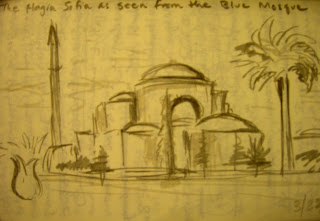
Sultanahmet Cami, or the Blue Mosque. Absolutely breathtaking in person.


The Aya Sofya ("Holy Wisdom"), which was built in the 5th century A.D. by the Emperor Justinian, had the largest dome in the Western World until the Duomo was built in Italy hundreds of years later. It is easily the most beautiful and fascinating place I've ever been inside. (The inside will be a separate entry soon.)


My original sketch of the Aya Sofya as seen from the courtyard near the Blue Mosque.


And finally, the two mosques together in a layout for one of my many spreads about my trip to Istanbul.

More to come tomorrow. But for now, bedtime. Hope you enjoyed this, and goodnight!

Sunday, October 25, 2009

Meryl Streep in Istanbul

Disclaimer before I get started: No, I did not see Meryl Streep in Istanbul. But the title of this entry will make sense to you by the end.

So I realized I haven't really shown any new process photos of spreads I'm currently working on in a while, so here they are.

While in London, I took a weekend trip to Istanbul with about twenty other students and two guides. There, we had the chance to meet with a high school student who spoke with us about politics, religion, and social equality in Istanbul and in Turkey as a whole. It was incredibly interesting, and the discussion stuck with me, so I decided to include it in my graphic novel.

But as you will see below, my original spreads were:

crowded...


and extremely text-heavy.

A lot of my editing process is about "capturing the essence" of what I want to explain or illustrate with a particular story. Especially because each story only gets two pages in the entire book (not so in my original draft), the message has to be concise. And in order to make that message concise, there must be a lot of crossing-outing and a lot of moving-arounding of text, frames, and focal points. (See below.)


As Bill, my Capstone advisor, puts it: "There needs to be two of you. The creator and the editor. The creator can put in whatever she wants, include everything for the original draft. But then the editor comes in. And the editor is another part of you that's like-- who's that woman from The Devil Wears Prada?-- Meryl Streep. Your editor has to be like Meryl Streep. Comes in and puts her foot down."

Well, I hope all my scribbles and rewrites make both Bill and Meryl proud.

Monday, October 19, 2009

Greenwich

One of my spreads for this week is based off of the first trip I took to Greenwich (which is surprisingly close to Central London). Greenwich is home to craft and antiques fairs, a pretty cool record store, lots of cute little shops, a beautiful expansive park that used to be a hunting ground for the royal family, and-- of course-- the Prime Meridian.

In the spirit of that spread, I thought I'd share some of my favorite photos from our Greenwich trip.

The Prime Meridian and its accompanying observatory are on a hill look out over all of London. It's a fantastic view.


This is the Time Ball (yes I know-- imaginative name) atop the Observatory. The sailors used to wait for the Time Ball to drop before they would set sail so they knew what time they were setting off on their journey. Women would stand on the docks and set their watches by the Time Ball, then tell the time to curious passers-by for money. My friend Janet thinks this is why we have the phrase "she wouldn't give me the time of day."


It's the Prime Meridian of the World. Seriously.


And there I am, making a fool of myself on two hemispheres!

I know I haven't been showing actual spreads that much, but they'll come more when they're in more finalized stages. And soon I'll be starting to experiment with how I'm going to ink and color the pages, so I'll definitely post all of those experiments. But hopefully in lieu of artwork this time around you do enjoy these photographs. See you again soon-- just from one hemisphere, though.

Monday, October 12, 2009

Lists and Brainstorms

After getting home from London, I bought a pocket-sized spiral-bound sketchbook to carry around with me and make lists (often spontaneously) of what I wanted to include in my graphic novel.  Some things were literal, like places I'd visited.  Other things were more metaphorical, like emotions I felt or symbolism I placed on common objects.  There were many, many lists... these are just a few.

This list went on for pages, but some of the things on this paget: Dublin, Istanbul, Solsbury, Stonehenge, rain, Underground, communication, loneliness, alcohol, newness.

On this list, I starred "independence"-- this is one of the most important themes to me, both in this graphic novel and in life going forward from my semester in London.

The top of this list contains some of the media I would like to experiment with when it comes time for coloring the spreads.  I want to stay as computer-less as possible for this entire process, so the coloring will be done by hand using probably watercolor and/or watercolor pencils.
 
"Honesty": the most important thing in this entire project.

More Sketches

Hey everyone!  Hadn't updated in almost a week, so I thought I'd share a few more sketches from my time abroad.  

Our school in London sponsored a day trip to Bath, where we got to see the old hot springs and baths, tour the town, and drink Bath spring water.  (Which, according to a Charles Dickens character, tastes like "warm flat irons."  Dear Charles Dickens, you were right about that one.)  This is a sketch of the Great Roman Bath.  


The fountains in Regents Park are absolutely gorgeous.  I drew this sketch in late April (the date is in the bottom left corner) when all the flowers were in bloom and everything was so picturesque.  My last couple weeks in London, I made it a habit of going to Regents Park and just wandering around.  (Since I have no sense of direction, getting lost isn't that much of a stretch for me, hehe.)


This spread has two sketches: on the left is Allie sitting at the Ivy House, a pub near our school building.  On the right is the famous author Philip Pullman.  Allie, my friend Jackie, and I took a train up to Oxford to see him speak about his trilogy His Dark Materials.  I took copious notes during his talk-- I will probably share some of them here soon, as I took a lot of his words as advice for starting my own writing endeavor, which has turned into this graphic novel.


On the top of this spread is another sketch from our trip to Oxford: Jackie sitting on the lawn of one of the many colleges on the Oxford campus.  On the bottom, sideways, are some quotes from the Philip Pullman lecture we had just attended together.

That's all for now.  Progress on spreads will be coming up in the next couple of days.  But I hope you liked the sketches!  And be sure to check back soon for more graphic novel goodness.


Tuesday, October 6, 2009

Firoozeh Dumas

Hello and happy October everyone!  I want to take this opportunity for thanking everyone who has commented so far, or made comments to me non-virtually.  I promise I'm not trying to pester people-- I just really appreciate feedback.  Keep the comments coming!  

Now, onto the topic of the day.  It seems that the universe is conspiring for me to meet all these inspiring authors this semester.  First it was Marjane Satrapi (see the entry a couple weeks back).  Today it was Firoozeh Dumas, an Iranian-born, American-raised female author of the books Funny in Farsi (which is now being optioned as a sitcom by ABC) and Laughing Without an Accent.  My English class, called Reading Gender and Sexuality in the Arab World, had a Q&A session with her today, and she was wonderful-- very bright, very personable, and very funny.  Though she is not a comic writer, she is a memoir writer, and had some great things to say about the writing process, inspiration, and writing from your own experiences:

"The thing I love about memoir is that you can write about any memory that is at the forefront of your mind."  (I found this quote especially relevant, because my graphic novel is a kind of memoir that jumps through memories not in chronological order, but based on memory triggers and related themes-- or, to put it another way, whatever is at the forefront of my mind at the time.)

"I try to be sensitive to my subjects." (This is an issue for me because I am telling stories that involve real people in my life, and I have to be cognizant of the fact that they will also become characters and be portrayed to people who don't know them.  It's a funny thing for me to draw my own family and friends.)

"No matter what you do in life, there will be people who criticize you."  (This one's not just relevant to me, but I thought I'd share it because it sure is true.)   

"If any of you ever writes a book, the independent bookstores will be behind you."  (I include this quote because one of the goals I have writing this graphic novel is to eventually attempt to get it published by an independent comics company.  She really spoke highly of independent booksellers and how they stand behind new talent, so this gives me some hope for the future after this process is finished.)

"I bet everyone in here has at least one thing that's happened to them that would make a really great story."  (Let's hope so!  Because that's exactly what I'm attempting to do.)

"If you have an eye for life, there are so many tales you can tell."  (I just thought this one was inspiring.)

And here she is.  Well, a sketch of her at least.  I did this during the Q&A so all I had was my spiral notebook, hence the blue lines in the background of the paper.

So now I'm off to work on my layouts for this week, which I will hopefully post something on later in the week.  Thanks again for the comments, and tune in next time!